
If you are a regular visitor to our website, you probably noticed it looks quite different than it used to. The old look, which served us well for many years, was starting to look a little out of date, and was missing some of the modern features that most websites have these days. So we decided it was time to make some changes.
The information that is found on the website (called “content” by web developers) has not changed. Everything that was there on the old site is still here, it just may be presented in a different way.
The new look was achieved by using a modern “Theme”, which is software that determines the “look and feel” of a website. Every theme comes with various built-in features, and some of them can be adjusted to fine-tune the final presentation. Some of the new features that we used are listed below.
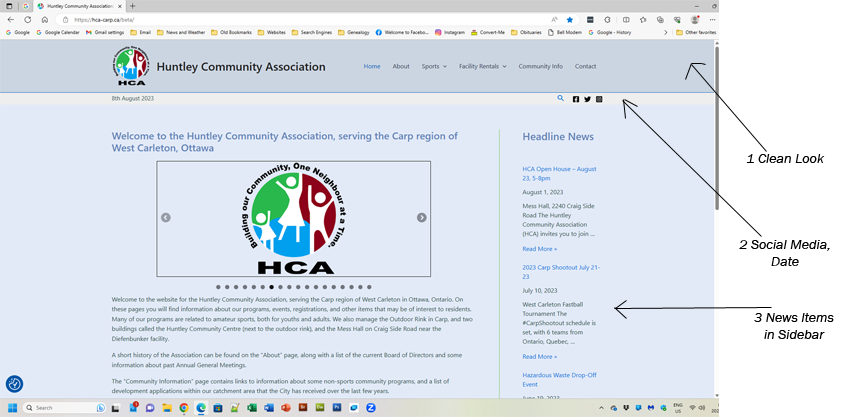
- New clean look using a soft blue background and drop-down menu items to group page links in categories.
- Social Media links and today’s date appear just below the main heading area.
- Headline News items with a preview of the text and “Read More” links appear in the Sidebar area on every page.
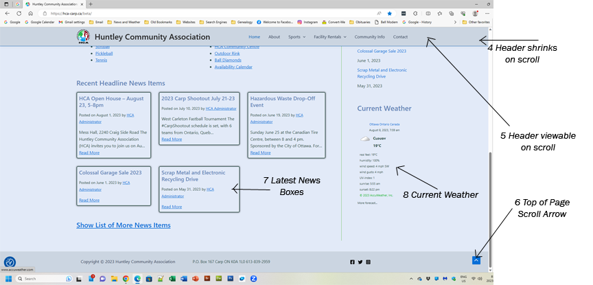
- The Header area with the menu shrinks in size when you scroll down to allow more room for the page content.
- The Header menu items remain visible at the top of the page when you scroll down. This is called a “sticky” menu.
- A scroll arrow appears at the bottom of the page when scrolling down to easily go back to the top of the page.
- The latest news items appear on the Home Page in eye-catching boxes for better visibility.
- A summary of current weather conditions appears in the Sidebar area.
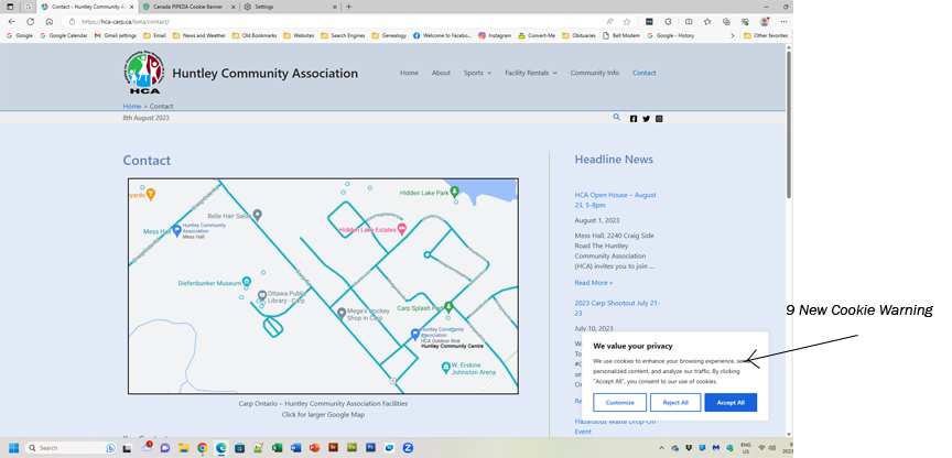
- A new Cookie warning appears in order to make the website partially compliant with privacy regulations. More work is needed to fully comply. Currently, the warning appears once every 2 weeks unless you clear your web browser cookies.
The new theme is also better at being “responsive”. That means that the presentation that is seen automatically changes by adjusting the layout in order to be viewable on various sizes of platforms such as tablets or cell phones, and not just on a larger computer screen. It may not be perfect, but it is at least viewable fairly well.
We may find some areas that need a little adjustment as we go along, so don’t be surprised if things change a little over the next while. This is a bit of a work in progress, and as often happens, it may not be working just the way we want the first time. We just hope it goes smoother than the LRT.
We hope you enjoy the changes.